When New Yorkers grow tired of living in an endless metropolis, they may choose to visit the park.
Weary New Yorkers may visit the park for recreation, social gatherings, relaxation, or the chance to completely forget that they are in a city. Fortunately, New York City has many parks with large natural environments and an enormous network of streets and public transportation services to get her there. This blog post begins to map how parks are connected with New York residents and reveals some surprising network components. Further analysis of this data should consider park access through a more critical, justice-informed lens, which could inform many planning decisions. Let’s look at how long it might take to get to the park. 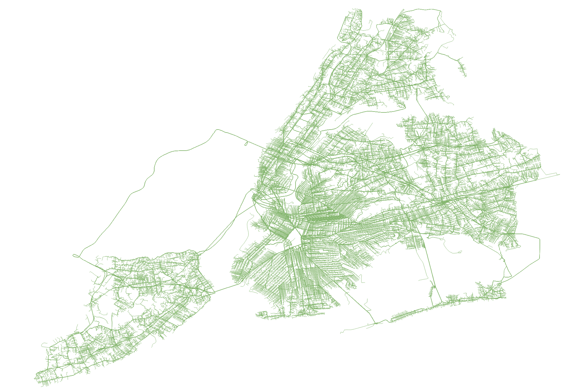
Routes to Prospect Park from every block in NYC (about 33,000)
To begin our research, we identified 47 parks across the five boroughs, known for their vast forested, marsh-like, or otherwise natural-seeming environments. These parks, designated as “Forever Wild” by NYC Parks or managed by State or Federal agencies, represent some of the most ecologically valuable land in the city, boasting “towering forests, vibrant wetlands, and expansive meadows.” 335 park entrances were then manually mapped using QGIS and OpenStreetMap data.
Using OpenTripPlanner and the OpenStreetMap road network, travel time isochrones were generated for each park entrance, ranging from 4-to 90-minutes by foot and public transportation. Transit routes and schedules were downloaded from the MTA (subways, buses, LIRR, MetroNorth) and NYC OpenData, courtesy of the Department of Transportation (NYC Ferry, Staten Island Ferry). For Prospect Park, the process looked like this:
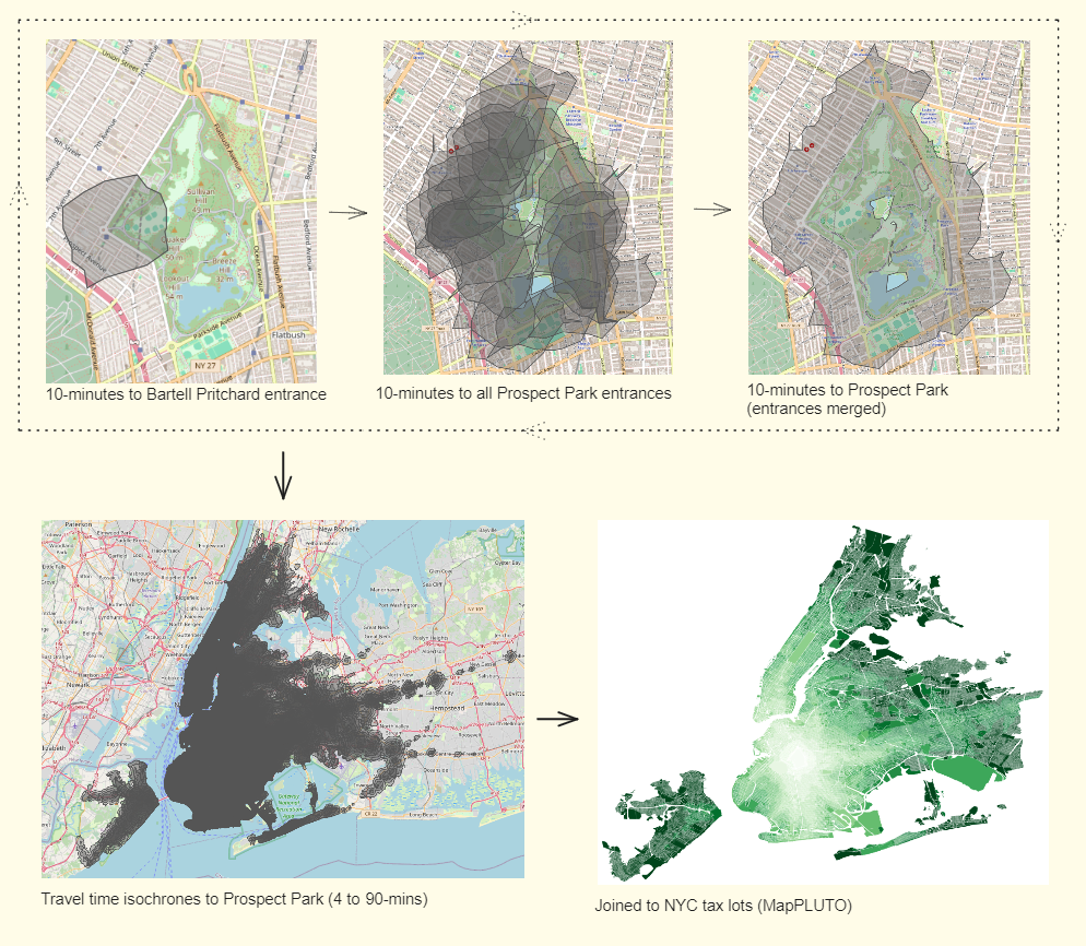
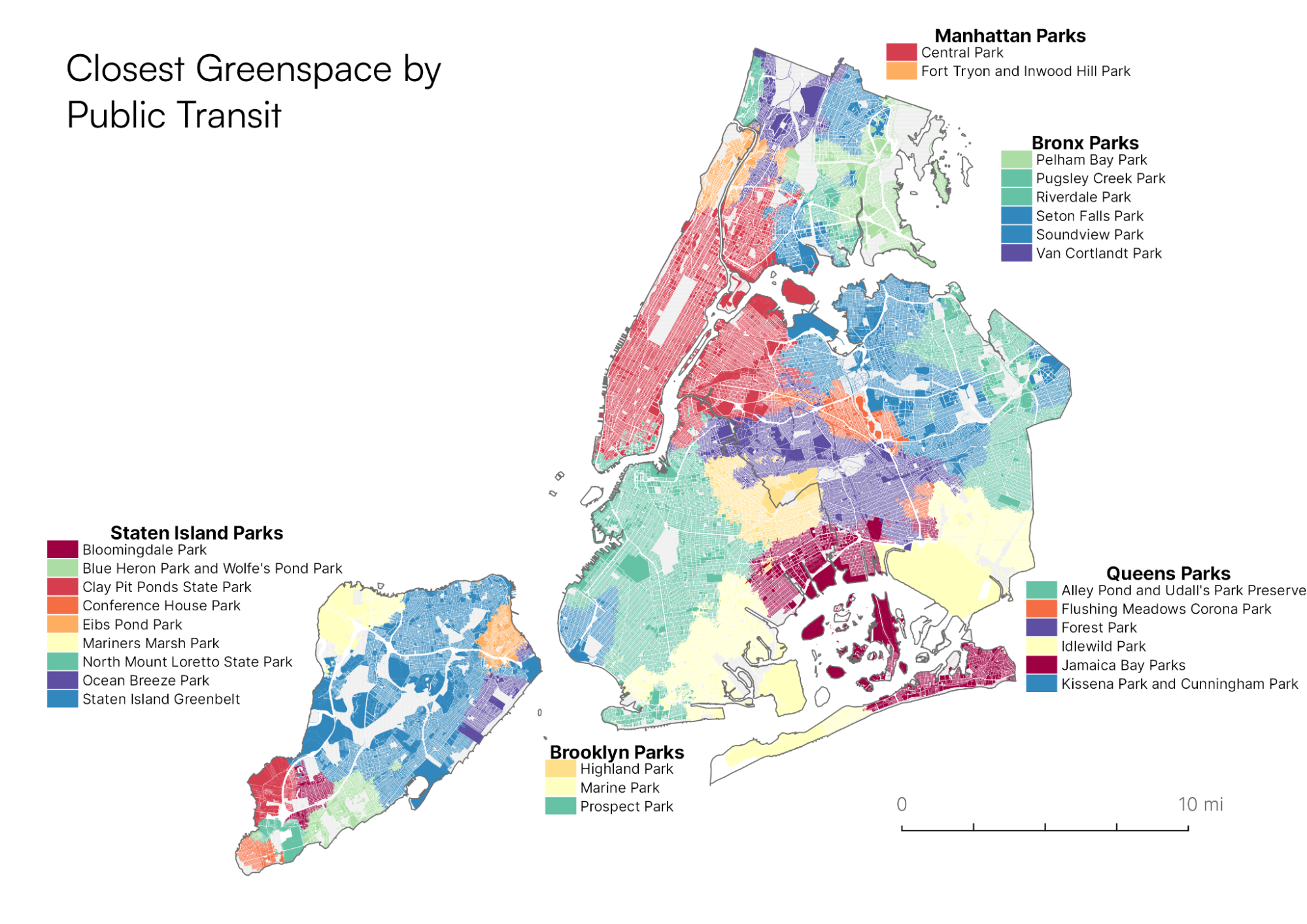
The computer needed a few hours to generate 15,000 isochrones for the additional parks. Eventually, we had everything we needed to join the travel times to City Planning’s MapPLUTO data set to visualize travel times to the City’s significant greens paces from every tax lot in New York City. The map below compares the travel time to all major parks we previously identified. The color corresponds to the shortest possible trip to a park:
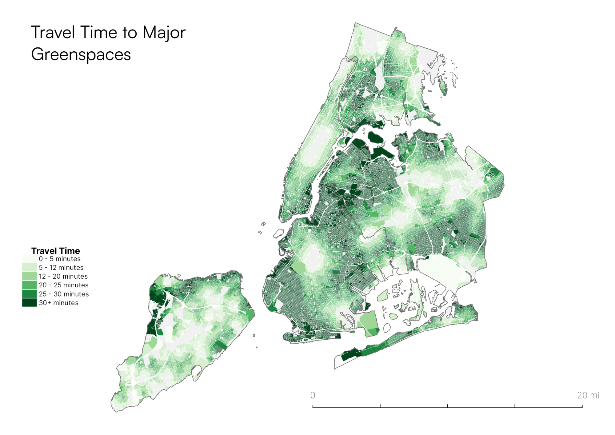
The travel times depicted above correspond to the closest major greenspace from any given tax lot in New York City. The names of those parks are depicted in the map below:
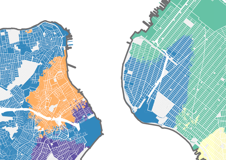
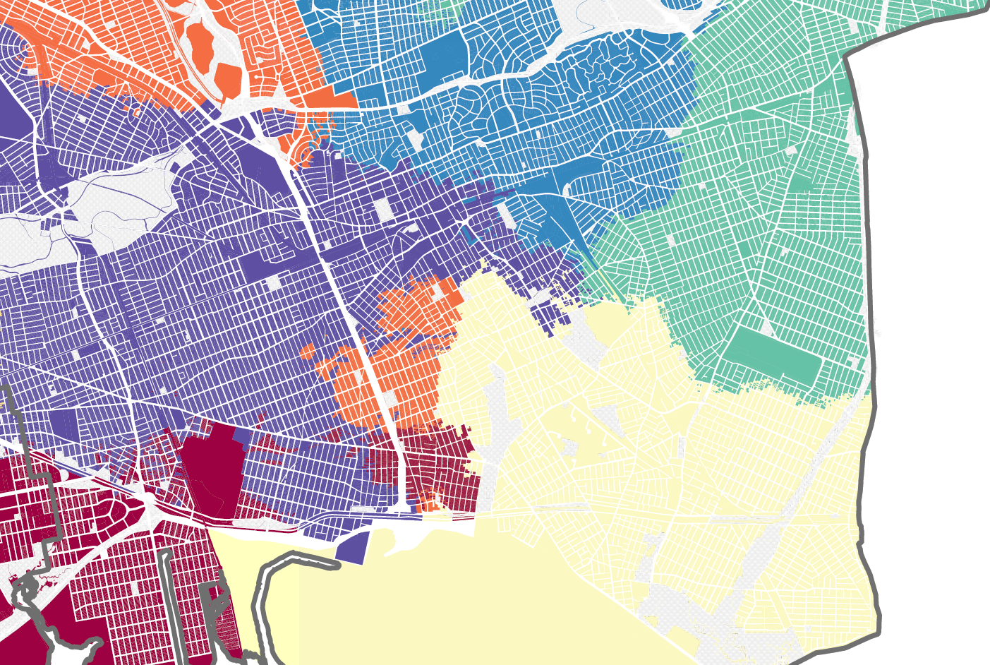
 These maps depict a surprising relationship between transit infrastructure and park access. Subway stations and select bus routes are crucial determinants of park accessibility, especially when walking to the park isn’t an option. As a result, “transit islands” emerge where specific areas are surprisingly closer to distant parks. Examples include:
- Neighborhoods in South Brooklyn have easier access to the Staten Island greenbelt than Prospect Park- thanks to the S93 LTD Bus and others traveling over the Verrazano Narrows bridge.
- In South Queens, proximity to bus routes like the Q40 creates several interesting islands of park access:
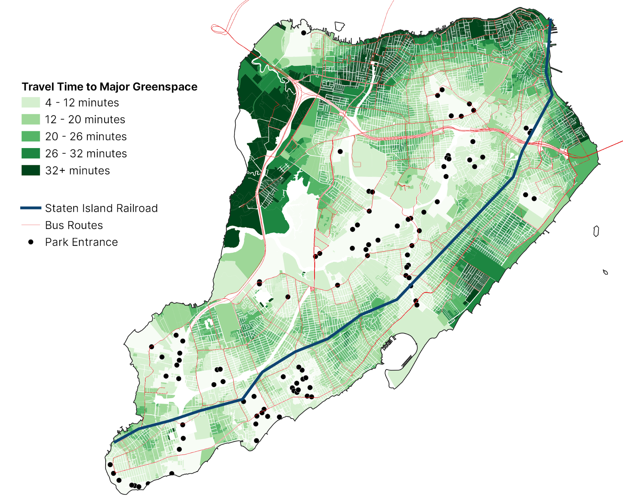
The maps also underscore the unique context of Staten Island, where the abundance of large parks like the Staten Island Greenbelt diminishes the importance of transit accessibility:
These maps tell an intuitive story: those who live within walking distance of a major park or are close to a transit line that can bring them there will spend less time traveling to the park. This GIF of travel routes to Prospect Park is a testament to this, with subway lines quickly shooting out from the park, followed more slowly by walking paths: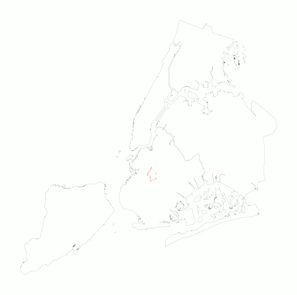
Transit Routes to Prospect Park